Replayink

Interactive demo recording

Turn your video into a live experience.

Use any web app while Replayink records, press stop, and the share link is already on your clipboard. Whoever opens it watches it play like a video — then presses the buttons themselves. Nothing to install on their end.

Add to Chrome Free · Chrome & Edge · no account needed
  1. 1 It plays like a video Someone refunds a payment. You just watch — the page is not yours yet.
  2. 2 Then you can click it It was never a video — it is the real page. Open the payment, type your own amount, refund it yourself.
dashboard.rowan.co/paymentsready
0:00
Share this demo

That is the whole handoff. Whoever opens the link lands here with the recording playing; once it is theirs, the link points at the step they are on — the same #s= a real share link takes.

Shared the moment you stop

From stop to sent in one click.

No export step, no upload to sit through, no editor to get past first. Press Share link and the address is on your clipboard. Re-publish later and it is still the same link.

  1. Record Press R and use the app the way you always do — across pages, tabs and pop-ups.
  2. Stop Every click, drag, typed value and dialog is already a step with its own screen. Rename or annotate them if you like; you do not have to.
  3. Paste the link It opens straight into the app, full-bleed, with none of our interface in the way.

Five ways to send it

Not a slideshow of screenshots

Everything the app did, it does again

Each screen is the real page — its HTML, its CSS, its fonts — without its JavaScript. What the app did after each press is recorded as it happened and played back at the same pace.

The honest limit: a replica runs none of the app's code, so what works is what was recorded. A button nobody pressed does nothing — and the player says so instead of pretending.

It started as an annotator

And it still marks up any page or PDF

Nothing below is a mockup. Each panel is the feature running.

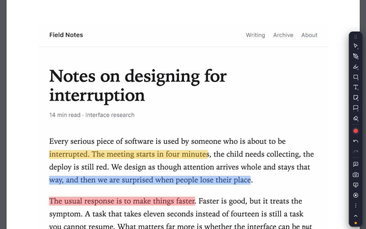
Highlight, and say why

Drag across a sentence to highlight it, then drop a comment pin on it and start a thread. Replies stack under the mark they belong to, so the argument stays next to the claim instead of in a separate document.

Keys: H highlight · C comment

fieldnotes.example/interruption

Notes on designing for interruption

Every serious piece of software is used by someone who is about to be interrupted. The meeting starts in four minutes, the child needs collecting, the deploy is still red.

What matters far more than speed is whether a thing can be put down and picked back up without having to reconstruct where you were. That takes a marker: a way to point at one sentence and say this one, the claim I do not believe.

Anchoring to a pixel position fails on the first reflow. Anchoring to an element fails the first time the framework re-renders. Anchoring to the text itself survives nearly everything short of the sentence being rewritten.

The measure of an interface is not how quickly a rested person can use it. It is how much of the work survives when they stop paying attention halfway through.

Given a way to mark things, people immediately want to sort what they marked. Colour costs nothing: you reach for the yellow one because it is the yellow one, and the meaning follows the habit.

Stick a note anywhere

Sticky notes go wherever you drop them — in the margin, over a figure, next to the paragraph you want rewritten. They are written in place, they stay where you put them, and they come back when you reload the page.

Keys: N note · T text label

fieldnotes.example/interruption

Notes on designing for interruption

Every serious piece of software is used by someone who is about to be interrupted. The meeting starts in four minutes, the child needs collecting, the deploy is still red.

What matters far more than speed is whether a thing can be put down and picked back up without having to reconstruct where you were. That takes a marker: a way to point at one sentence and say this one, the claim I do not believe.

Anchoring to a pixel position fails on the first reflow. Anchoring to an element fails the first time the framework re-renders. Anchoring to the text itself survives nearly everything short of the sentence being rewritten.

The measure of an interface is not how quickly a rested person can use it. It is how much of the work survives when they stop paying attention halfway through.

Given a way to mark things, people immediately want to sort what they marked. Colour costs nothing: you reach for the yellow one because it is the yellow one, and the meaning follows the habit.

Send the marked-up page to anyone

Copy a share link and your highlights, notes and comment threads travel inside the link itself — nothing is uploaded to make one. Whoever opens it is asked first, then the same marks appear on their copy of the same page.

Keys: AltS copy share link

Your own devices stay in step

Marks are saved against the page's address and ride Chrome's own profile sync, so the highlights you left on your laptop are on the same page on your desktop. Sync goes through your browser account — never through us.

Settings → Sync & data, with a per-page list and JSON export

Point at things while you talk

Presenter mode gives you a laser pointer, ink that fades on its own, and a spotlight that dims everything but the part you are talking about. The page underneath stays fully usable, so you can keep driving while you point.

Keys: P presenter · L laser · D ink · S spotlight

fieldnotes.example/interruption

Notes on designing for interruption

Every serious piece of software is used by someone who is about to be interrupted. The meeting starts in four minutes, the child needs collecting, the deploy is still red.

What matters far more than speed is whether a thing can be put down and picked back up without having to reconstruct where you were. That takes a marker: a way to point at one sentence and say this one, the claim I do not believe.

Anchoring to a pixel position fails on the first reflow. Anchoring to an element fails the first time the framework re-renders. Anchoring to the text itself survives nearly everything short of the sentence being rewritten.

The measure of an interface is not how quickly a rested person can use it. It is how much of the work survives when they stop paying attention halfway through.

Given a way to mark things, people immediately want to sort what they marked. Colour costs nothing: you reach for the yellow one because it is the yellow one, and the meaning follows the habit.

Every action is a key, and every key is yours

Tools, colours, categories, the notes panel, screenshots, presenter and recording all sit on single keys. Remap any of them in Settings with a field that records the keys you press and warns you when two actions collide.

  • V Select
  • P Pen
  • H Highlighter
  • N Note
  • C Comment
  • M Notes panel
fieldnotes.example/interruption

Notes on designing for interruption

Every serious piece of software is used by someone who is about to be interrupted. The meeting starts in four minutes, the child needs collecting, the deploy is still red.

What matters far more than speed is whether a thing can be put down and picked back up without having to reconstruct where you were. That takes a marker: a way to point at one sentence and say this one, the claim I do not believe.

Anchoring to a pixel position fails on the first reflow. Anchoring to an element fails the first time the framework re-renders. Anchoring to the text itself survives nearly everything short of the sentence being rewritten.

The measure of an interface is not how quickly a rested person can use it. It is how much of the work survives when they stop paying attention halfway through.

Given a way to mark things, people immediately want to sort what they marked. Colour costs nothing: you reach for the yellow one because it is the yellow one, and the meaning follows the habit.

PDFs get exactly the same tools

A PDF link opens in a viewer with the whole toolbar available, including real text highlighting rather than a rectangle drawn over the words. It is recognised by what the server says it is, so a link with no .pdf in it still opens here. Downloads still download.

A PDF open in the extension's own viewer with three passages highlighted in yellow, blue and red.

Everything on the page, in one list

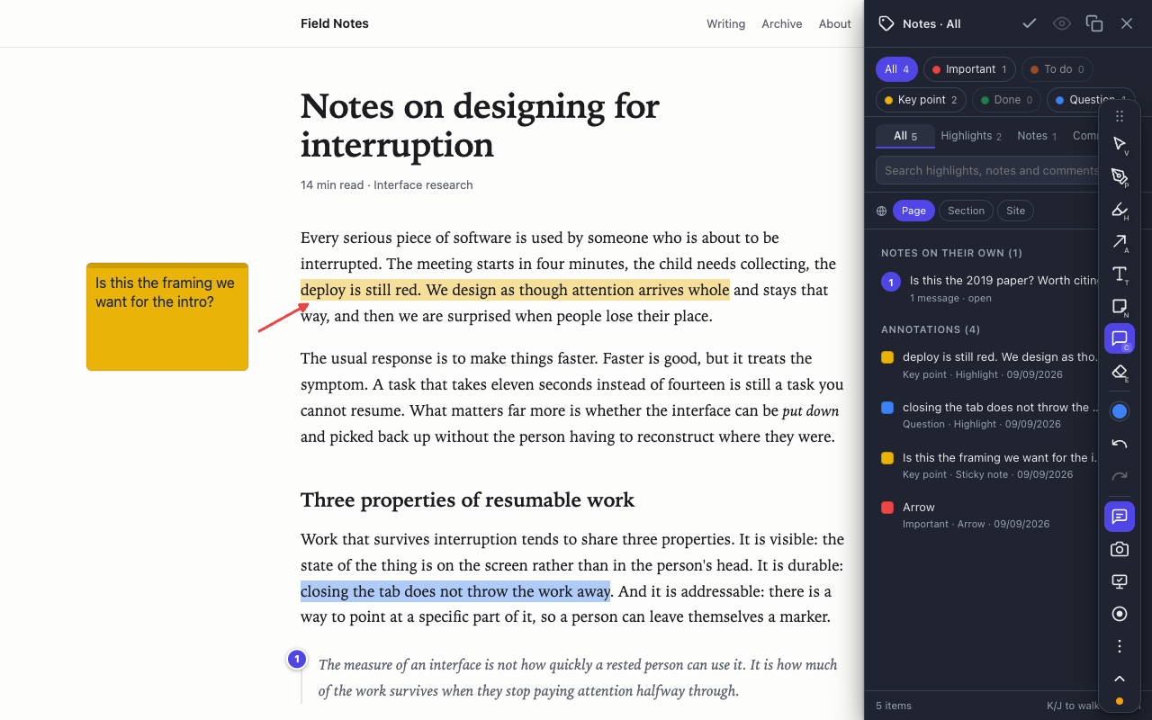
The notes panel shows every highlight, note and comment on the page, with a live count per category and a search box. Filter to your open questions and read only those, then copy the lot as Markdown grouped by category.

The notes panel open beside a page, showing category filter chips with counts and a searchable list of every mark.
Coming next

Then: the same page, with your team on it

Comment threads that other people can answer, names on every reply, and an @mention that puts a question in front of the person who can settle it — on any page on the internet, not in a copy of it.

This is what is being built next. It is not in the extension yet: today a comment thread is yours alone, and the way to get it to someone else is the share link above.

fieldnotes.example/interruption

Notes on designing for interruption

Every serious piece of software is used by someone who is about to be interrupted. The meeting starts in four minutes, the child needs collecting, the deploy is still red.

What matters far more than speed is whether a thing can be put down and picked back up without having to reconstruct where you were. That takes a marker: a way to point at one sentence and say this one, the claim I do not believe.

Anchoring to a pixel position fails on the first reflow. Anchoring to an element fails the first time the framework re-renders. Anchoring to the text itself survives nearly everything short of the sentence being rewritten.

The measure of an interface is not how quickly a rested person can use it. It is how much of the work survives when they stop paying attention halfway through.

Given a way to mark things, people immediately want to sort what they marked. Colour costs nothing: you reach for the yellow one because it is the yellow one, and the meaning follows the habit.

A preview of work in progress, not a feature you can use today.

The same page, read properly

A highlight is anchored to the text it covers, not to a spot on the screen. Reload the page, resize the window, let the layout rearrange itself — the mark stays on its sentence.

Drag the handle across the panel.

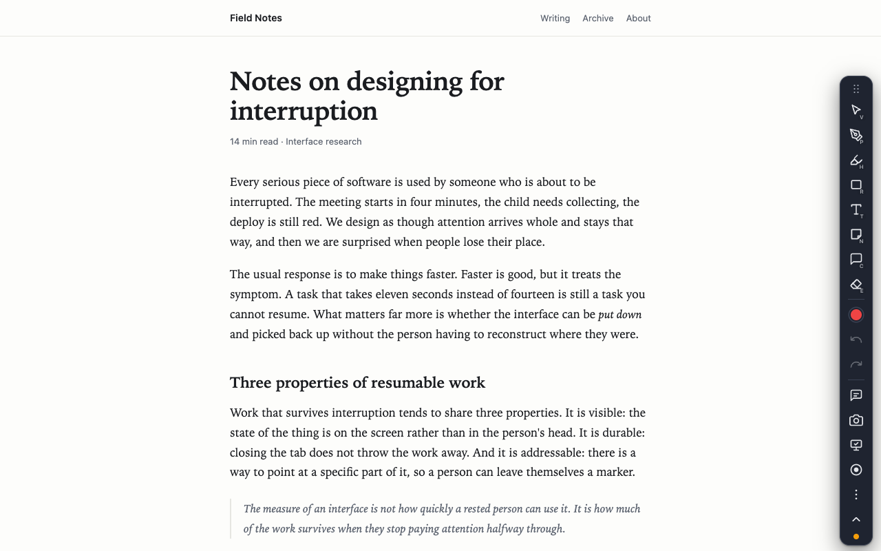
A plain web article with the extension's floating toolbar and nothing drawn on it.
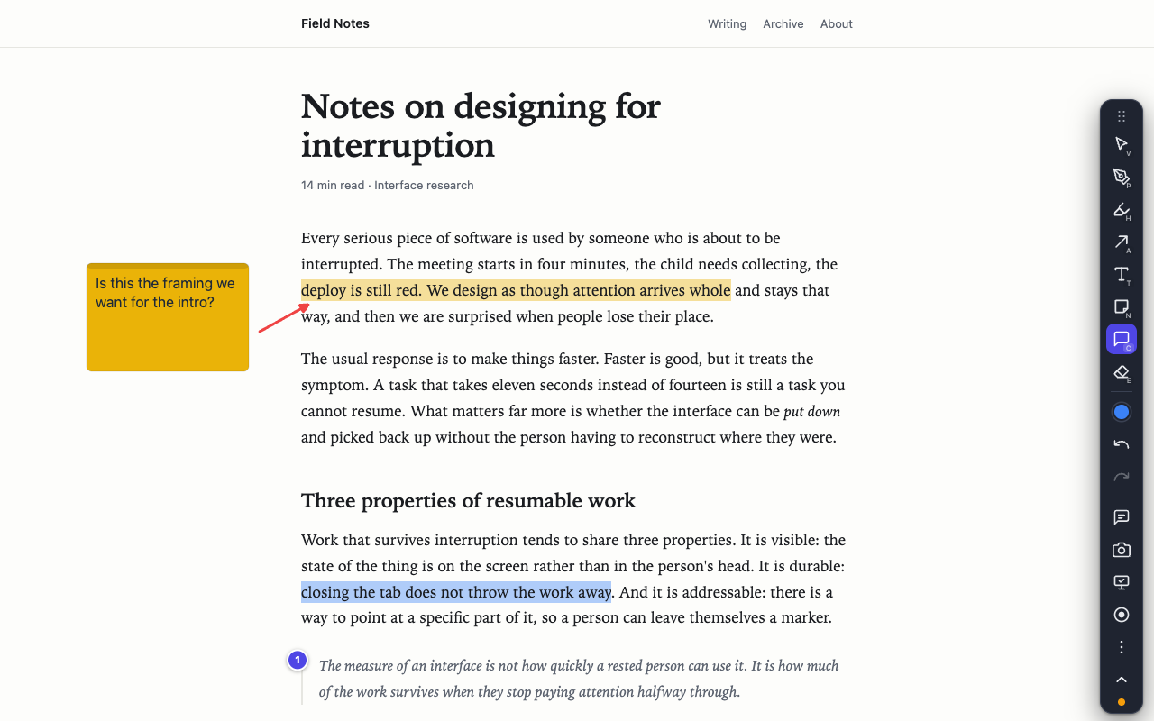
The same article with a highlight, an arrow, a sticky note and a comment pin drawn on it.

It works when the network does not

Annotating, PDFs, presenter mode, screenshots and recording all run entirely on your computer. No telemetry, no usage counter, no advertising SDK. We do not know which pages you visit, because nothing tells us.

The one thing that is ever uploaded is a recording you share by link. Before you do that on a site you are signed in to, read this first.

Add to Chrome Free · no account needed to annotate
A web article dimmed except for a bright spotlight around the pointer, with the presenter dock along the bottom.